It occurs that much of the distance between Quant and Fundamental investing can be bridged with better user interfaces.
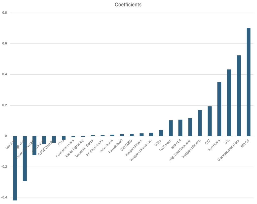
For example, in our previous post about “long probability” for a given stock, an additional and informative view of the binary classifier is the coefficients that make up the final result. We’re deliberately using a simple linear regression binary classifier to facilitate this explainability.
In the case of JPM we can show these machine learning model coefficients in a couple of different ways.
One visualization is simply rank ordering the weights in the model in a bar chart as shown.

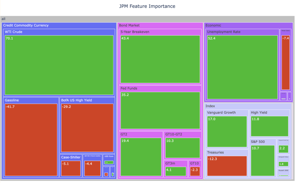
However a more informative approach wraps the features into some categories such as Index or Bond Market or Economic, and then translates the weights as sizes in a traditional S&P 500 style tree map:

This approach lets us see the weights by category and gives us a good sense, assuming the model is correct, how the stock trades. JPM trades well with short rates, oil, unemployment, and growth. Gasoline, high yield credit, and long dated treasury prices are headwinds.